Team
Emma Souannhaphanh
Amy Van
My Role
UX / UI Designer
Web Developer
Tools
Figma
GitHub
HTML/CSS/JavaScript
jQuery
Timeline
3 weeks (Winter 2023)
OVERVIEW
Concept
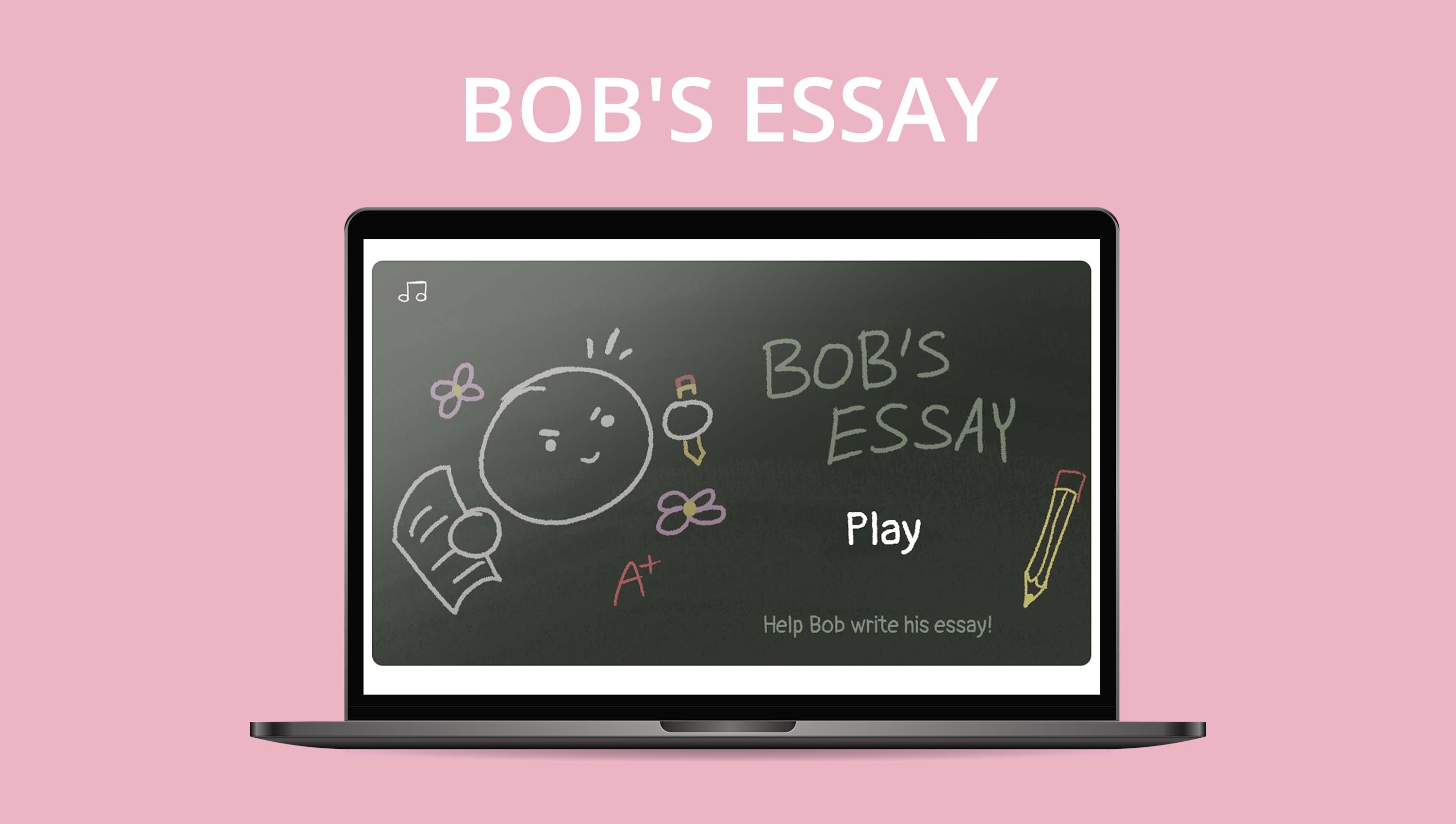
This project was completed as a group project for a web development design studio course over a timeline of 3 weeks. Bob’s Essay is a web game that is a twist on the well known Hangman! Instead here, every time you guess a letter incorrectly, you lose a heart and Bob’s expression shows more discontent. There are six different themes to choose from and hints to help you along the way!
Final Game - Demo
WIREFRAMES / MOCKUPS
Exploring the Layout
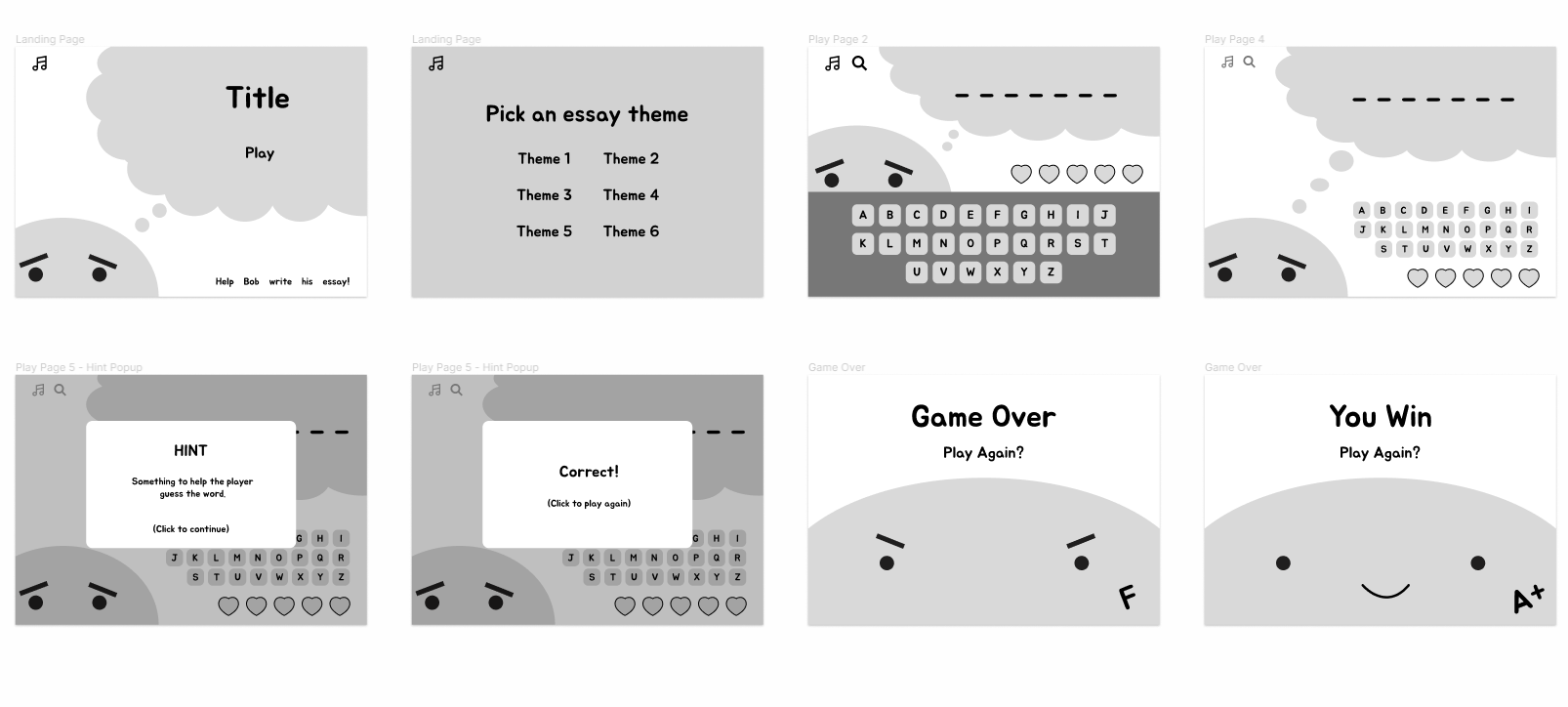
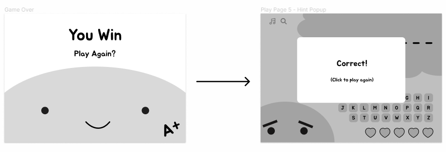
Wireframes were created to explore the layout of the different pages and states. The game consisted of a home page, theme selection page, game over page, and a win page.
ITERATION
Improving the User Experience
Wireframes were created to explore the layout of the different pages and states. The game consisted of a home page, theme selection page, game over page, and a win page.
DEVELOPMENT
Prototype → Final Game
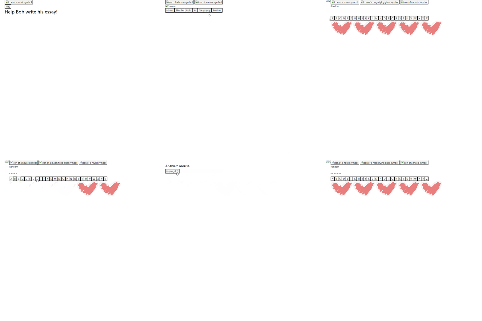
A working JS and HTML prototype was first created to test the functionality of the website. Once it was functioning, CSS was applied and the assets, the visual, and the audio feedback was included.
.png)
KEY FEATURES
Theme Selection
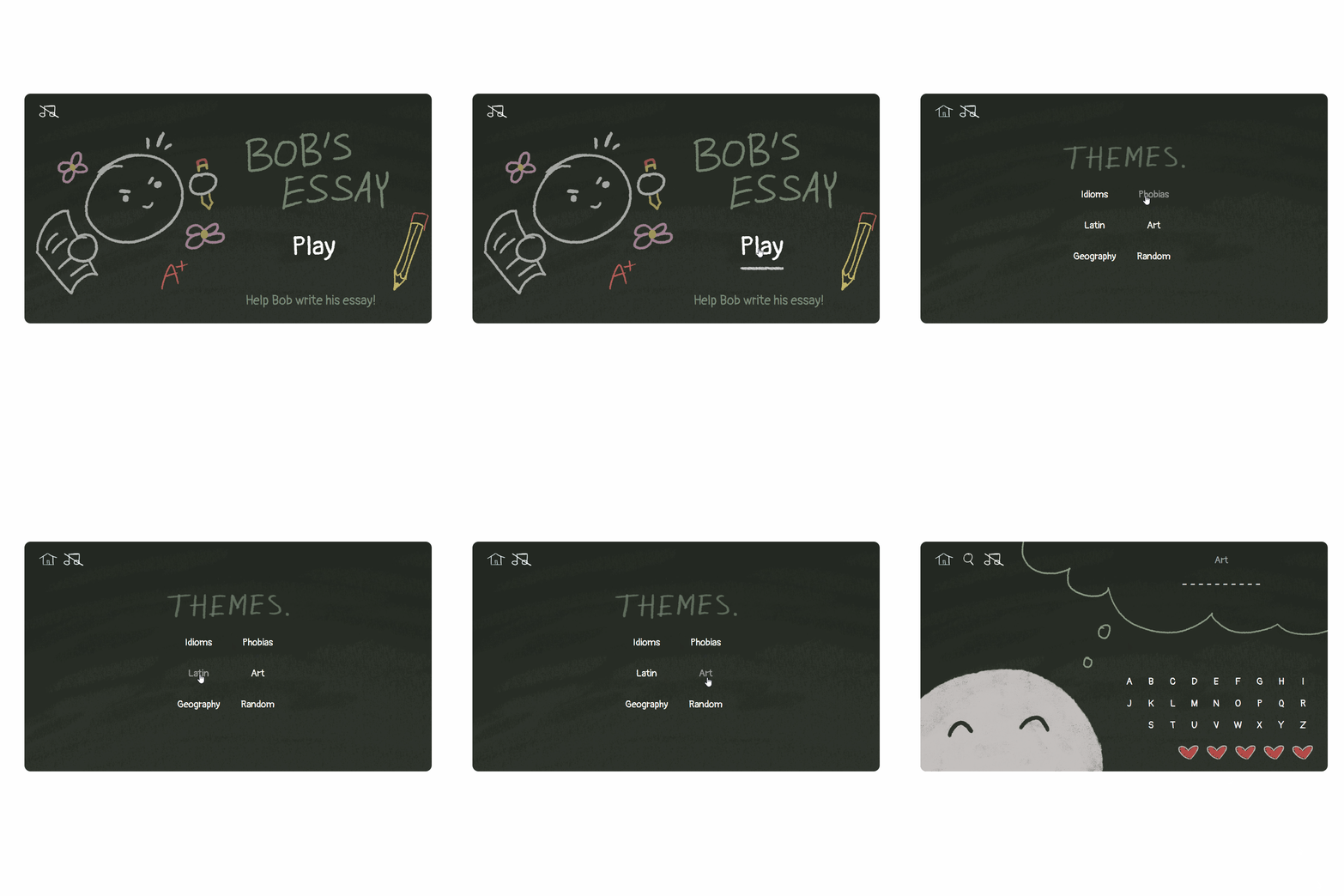
The player has the option to choose between 6 different themes when they start the game.
Hint System
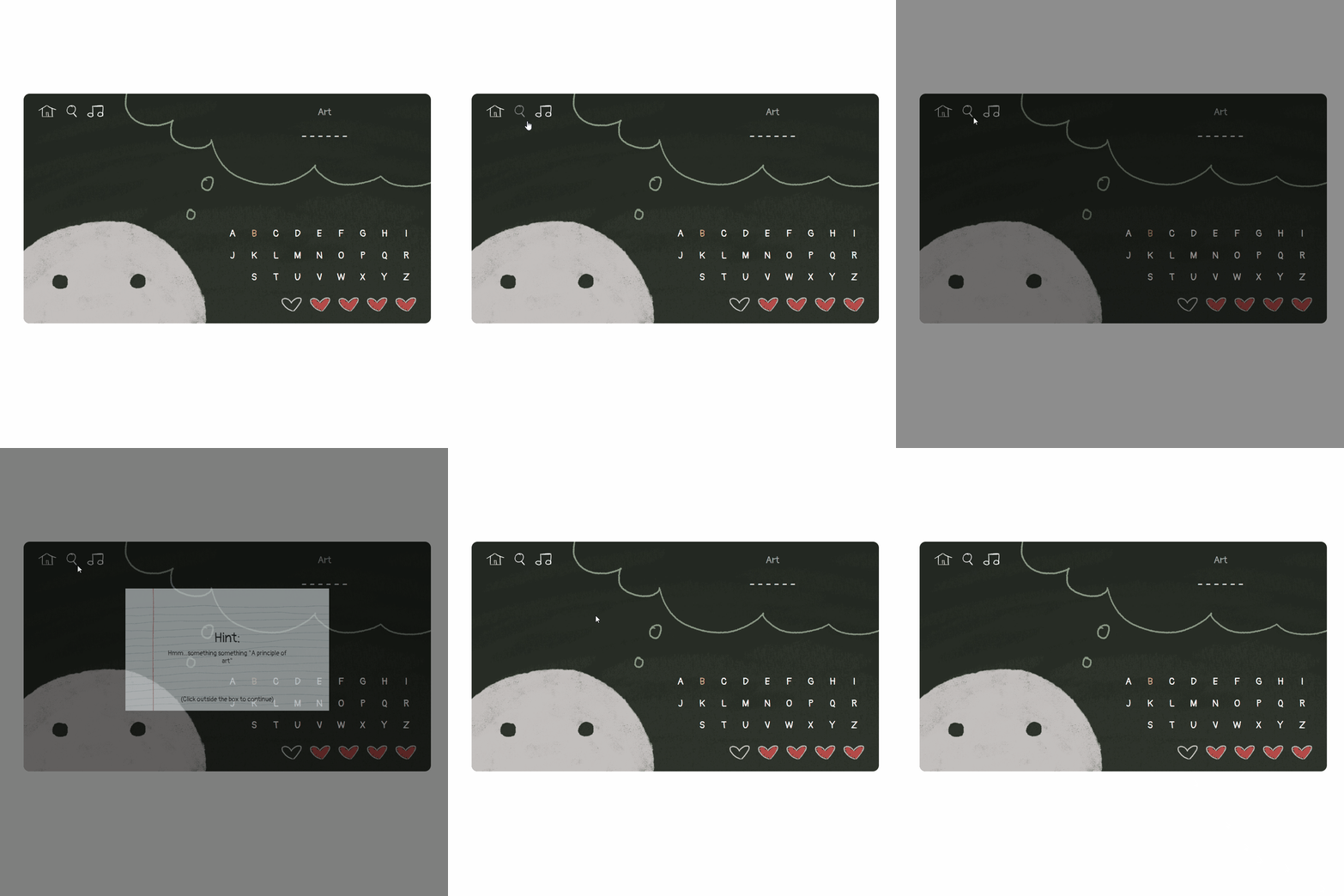
If a player is struggling with guessing a word, they are able to click on the magnifying glass icon which will display a popup with a hint.

Visual Feedback
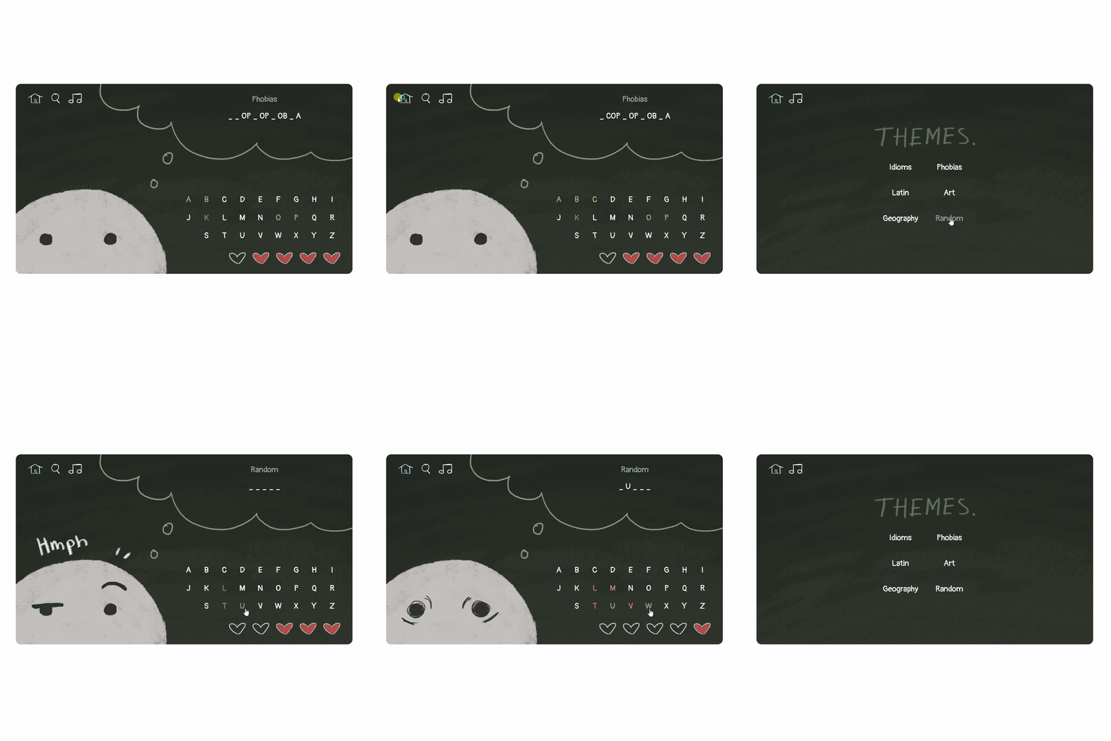
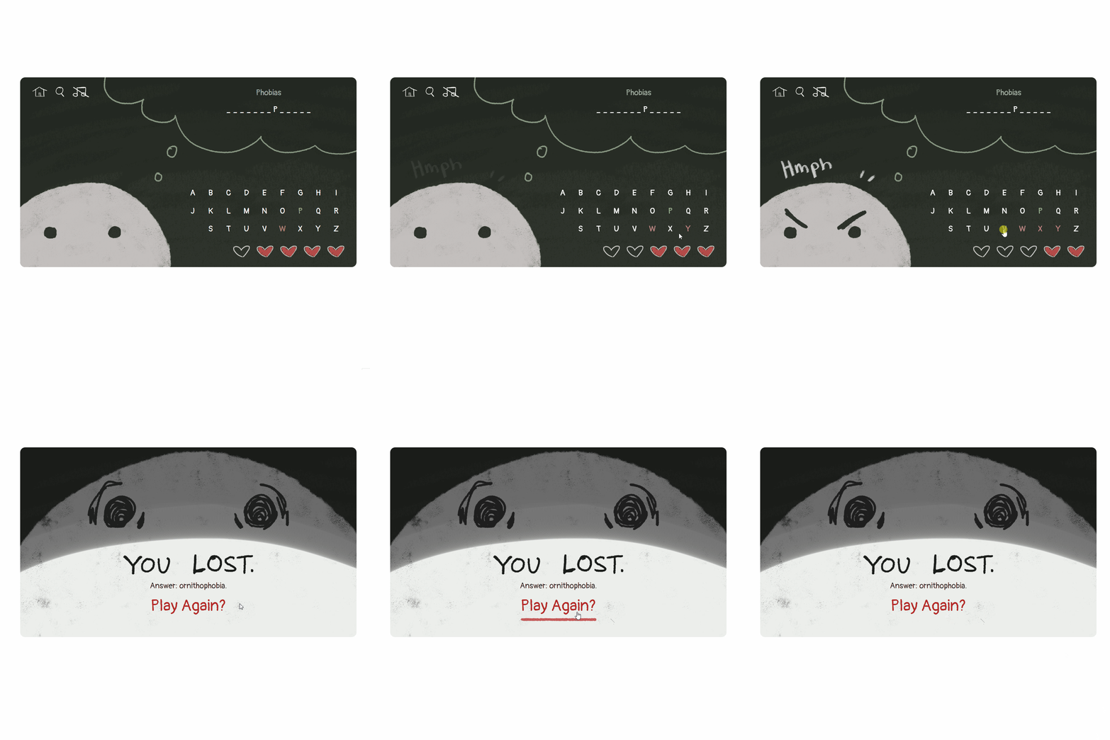
There is visual and audio feedback for when the player guesses a letter correctly and when a player guesses a letter incorrectly.
Game Over State
When a player loses all of the hearts before guessing the word, they will be brought to the game over screen, where a disappointed Bob will be shown and a prompt to play again will be displayed.
REFLECTION
Takeaways
Focused on creating a working prototype before adding visuals. It was much more efficient creating the prototype with JS and HTML first before styling and adding in assets. It made testing easier and when there was a problem, there would be less things to fix.
Importance of visual and audio feedback. The inclusion of audio and visual feedback for the player actions made the game much more interactive and fun.
Next Steps
Adding a score system. A next step would be to add a score system and a high score board that saves players' high scores.
Add more animations. We did not have enough time to focus on adding animations and the only animations we were able to add was “Hmph” sound effect and Bob blinking on the game over screen. There is much room to improve the game’s interactivity and engagement with more animations.
